return to homepage A REVIEW OF BO BARTLETT
return to updates
AT FORUM GALLERY
by Miles Mathis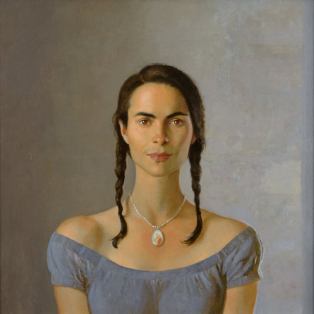
Unlike
mainstream critics such as Peter Schjeldahl or Arthur Danto, who
appear to intend to write uninteresting things that are also false,
or Dave Hickey, who appears to intend to write false things that are
occasionally interesting, I intend to write things that are both
interesting and true. I am seeking those true statements that tend
to go under cover in a milieu such as ours, getting lost in the noise
and bustle of a modern existence, and when I do find them they seem
to jump as from nowhere, like a grasshopper behind a leaf. So if I
tell you something you weren't prepared to hear, it is not by
accident. What you are least prepared to hear is often what you most
need to hear.
That said, I will begin this critique with praise. Like Graydon Parrish
and Jeremy Lipking and Yuqi Wang and a few other realists, Bo
Bartlett has always impressed me as an earnest artist, with talent,
imagination, and a great deal of potential. I don't know Bo, but
from reading his website he seems intelligent, well-read, and
genuine. Beyond that, I have seen several of his works I really
like, and that is rare enough in itself. I have used this piece
below the heading of my article on New Realism for years:
That
is a really lovely mood and composition, and the painting stands as
an example of that now rarest of adjectives in realism: subtlety.
This
is another of my favorites of his:
A
good composition, simple but strong. Here's another good idea for a
painting, done well:
And
this is also a good idea for a painting, although I think it doesn't
quite come off. 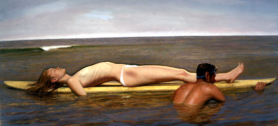
Take
away the guy and the white swimsuit (which looks like underwear) and
you would have a mystery that could almost sustain itself, without
eliciting a chuckle.
Those
are a few older works of Bartlett, but I am writing this paper mainly
as a critique of his more recent work, specifically of his show at
Forum Gallery, Los Angeles, in March and April of this year (2009).
Again, I will begin with the painting I like [see above, below title].
That's
a stunner, just about perfect. Great model, perfect color harmony,
strong mood, subtle but deep. The only false note is off the canvas,
in the title. “Sweetness” doesn't work, even if the
model is his wife, as I suspect. Not that she isn't sweet, but the
mood
of the painting isn't sweet. It may contain a smudge of sweetness,
just because she is so beautiful, but the painting goes way beyond
sweetness. The title conflicts with the painting, which is the last
thing you want. The title doesn't describe the painting, or even
suggest it. A title should either be a perfect suggestion of the
painting, or it should be an almost invisible tag. It should never
compete with the painting, or undercut it. Cutesy titles should be
avoided, as should pseudo-intellectual titles. This is how we
realists separate ourselves from the phoniness of Modernism. The
title here is a bit cutesy, and it is probably a pet name or inside
joke. As such, it can only distract from the “iconic”
nature of Bartlett's work. Bartlett has stretched the neck (I
assume) and simplified all artistic conventions (like color,
composition, etc.) in order to give his subject an eternal quality.
He has succeeded completely, I would say. All the more reason to
look sideways at that title. You do not title an icon “Sweetness.”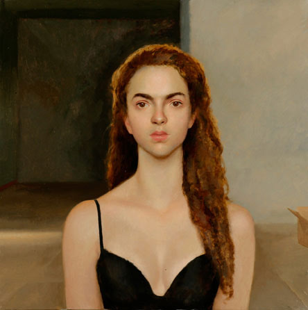
A
similar painting, “Alexis,” may be his daughter, since
she has mom's eyebrows. I could just look up these things, but I
can't be bothered. With icons, relationships are meaningless. What
is important is that this painting doesn't quite hit it like the
other one. It is not bad. Nothing is technically wrong here. His
beautiful and interesting model is well-painted. But the mood comes
off a bit flat. This younger girl doesn't have the interest in her
face that the older woman has, or Bartlett hasn't found a way to
bring it out fully. She needs a more expressive light and pose. The
light in “Sweetness” is more raking and one-sided, giving
us more mystery. The full warm light in “Alexis” works
to bring attention to the cleavage, which is admittedly nice; but, as
a matter of art, our eyes should be on her face. The eyes and mouth
set the mood, and if our eyes are wandering, we can't fully read the
mood. But the face isn't
emitting a coherent mood anyway. We are being blocked by the model.
She seems uncomfortable with the decolletage, and she punishes the
artist and us by building a wall. Bartlett may be aware of this
aloofness, trying to use it to build tension, but I doubt it. 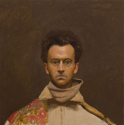
Bartlett
has a third face-on portrait in the show, of himself, but I would
call it a complete failure. As I read his face, I see a total wall,
a full psychological blockade. He is not only not
expressing anything, he is willfully repelling the eye of the
audience and painter (which in this case is himself). He might as
well title it “Don't Look at Me!” Beyond that, he has a
bad haircut painted badly, two collars that don't go together, one
floral shoulder, and one lapelled shoulder. The background is an
empty brown, like barren earth. It almost appears that Bartlett is
trying to do everything wrong here, on purpose. This painting may be
some sort of cry for help, and it should certainly be hung in his
psychiatrist's office, as a nest of clues.
Seven
of the 19 works in the show are portraits of objects: a scythe, a
bucket, a wine bottle, a jar of varnish, a burning broom, a rock, and
a set table. These may also be clues left for his psychiatrist:
otherwise, they are meaningless to me. I don't know why artists
paint these things or why people buy them. Bartlett isn't the only
one painting objects like this. Jacob Collins has painted candy
wrappers; Claudio Bravo has painted crumpled paper; and many other
contemporary realists are doing the same, painting blenders and
telephones and cars and fishing rods and subway turnstiles and tubes
of paint. They might as well be painting Brillo boxes and Campbell's
soup cans. Usually, it is the horrible search for subject by artists
with no imagination. But in the case of Bartlett, it shouldn't be
that. Bartlett has so often done better than that. Perhaps it is a
quota of small works given him by Forum Gallery to appeal to the less
rich. I don't know. But in my opinion the works are throw-aways.
He shouldn't waste his time on them, and he certainly shouldn't put
them in a major show.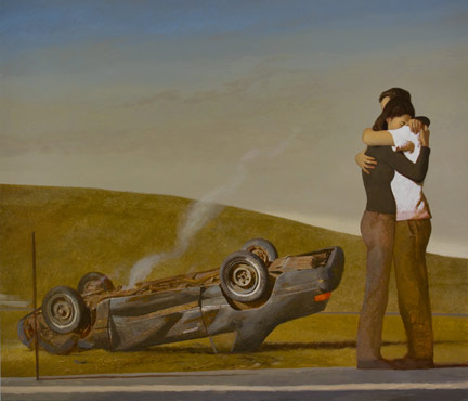
But
his large works are also unimpressive here. The worst of the lot, in
my opinion, is “A Miraculous Outcome.” This is a second form of his older painting "Car Crash," but he didn't bother to correct any of the weaknesses in the sequel: he just added some more weaknesses. Like many modern
realist works, it is wooden and manufactured. The idea is poor, the
composition is poor, and the paint quality is poor. The cliché
title fails to undercut it only because the whole
concept is cliché. You see this sort of work over and over in
galleries like Forum and John Pence and the other top realist
galleries, where any one of a hundred oversold artists are trying to
manufacture a paintable event, and failing utterly to do so. The
background is empty and boring, the car is too small, the people are
cutouts, and the color is off. Just look at their pants and shoes.
Even in this small photo, you can tell that everything is wrong. Is
he standing on her toes? Are his pants transparent? Why are his
pants the same color as the grass? Wouldn't any other color have
been better? What is that shadow under his sleeve and on the back of
his shirt? If it looks awkward here at 4 inches you can be sure it
looks even more awkward at 90 inches. But even if it were painted
perfectly, it would be a stupid idea. Painting can't and shouldn't
compete with TV and film in documenting contemporary tragedy. A
painting of a car wreck must look pathetic next to live coverage or a
cinematic treatment. 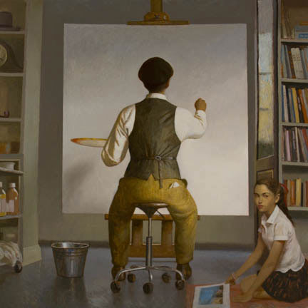
"A
New Beginning" isn't much better. Clearly an homage to
Rockwell, this painting doesn't generate any interest at all. The
background is a mess, with the bookshelves off-kilter; the sleeve
once again contains strange shadows; and the outfit of the artist is
ludicrously outdated, without any apparent reason for being so. The
only possible interest is the little girl in the corner, who has a
nice mystery in her stare. But the overall effect of the work is
equivalent to the effect of the canvas within the canvas: it is a
blank. 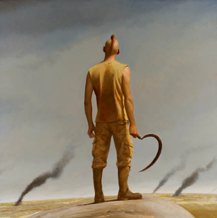
One
of the two sold works, “Empire,” was painted in 2007.
But I don't see the appeal. As with “A Miraculous Outcome,”
Bartlett appears to be following Nerdrum. “A Miraculous
Outcome” was a sort of return to the Bartlett of the 80's, when
he was following the younger Nerdrum, seeking “modern”
excuses for painting multi-figure works. Likewise, “Empire”
follows late Nerdrum into the realm of fake myth and apocalypse. We
lack the Nerdrum clouds, drifting lazily by like zeppelins, and we
get a mohawk instead of a leather helmet, but the idea is the same:
violence, rubble, and the end of days.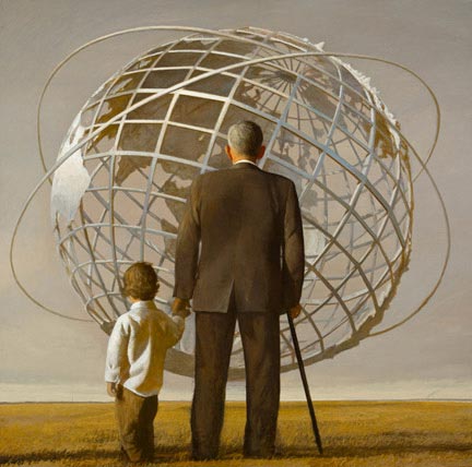
The
other sold work, “Kingdom of Ends,” is a return to the
Bartlett of the 90's, when he went strongly Americana. I read this
work as a mild paean to technology or globalism, which must go over
like a lead balloon eight years after
9/11. Either that, or it is intended as a mild rebuke of globalism.
In either case, the mildness is a problem; and in any case, the
ambiguity is dangerous.
The
conservative, Rockwellian, jingoistic faith in the sanctity of the
American Dream has been obliterated in the last decade by both
political parties and all their operatives in the media, and
paintings like this can be read as either hopeless naïvete or
purposeful misdirection.
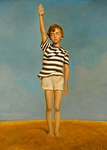
The
same can be said of other Bartlett paintings, beginning with
“Allegiance.” I find very little irony in Bartlett's
treatment, which must make the painting prone to be read as a
50's-style piece of bald propaganda, promoting blind allegiance to
government. Yes, the child has his eyes closed, but that is entirely
too subtle for the current political climate. More important,
psychologically, is that we have a beautiful child in bright sun and
blue sky, and a title “Allegiance.” This painting could
hang in Dick Cheney's home, with none of the guests aware of the true
message. I assume Bartlett is not
intending to propagandize blind allegiance, but his mild treatment is
not appropriate now. It may have been the right flavor for the 90's,
but the world is not what it was then.
An
artist is not required to address politics, but if he does, he is
required to mirror the gravity of it. Even in the 90's, Bartlett was
only putting a toe in where a full dive was required. In his
painting, “Old Glory,” a young girl is wrapped in the
flag. He may point out that the flag is soiled and that the girl is
near a cliff, but again, that is entirely too subtle for the subject.
It is not obviously
a cliff, it might just be another of his rocks; and the soiling is
subtle enough to be misread as shadow. Which means that this
painting is entirely too easy to read as jingoism. 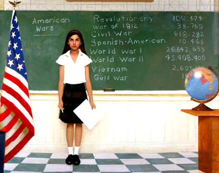
“History
Lesson” is also weak. Bartlett can claim it is a lesson in
pacifism, but it is not a strong lesson. We already know that a lot
of people died in wars. That is the definition of war. Putting some
numbers on a blackboard is not going to impress anyone, especially
when they are watered down by a pretty Rockwell composition and a
giant flag. Bartlett didn't even manage to fit in the Korean War,
and his numbers for the other wars are way too low. If we include
civilian casualties, for example, the number for Vietnam is closer to
six million. And even Wikpedia admits that
the total for WW2 is around 60 million. Without talking to Bartlett
in person, we don't know what his intention is here. But ambiguity
in politics is not a virtue. Subtlety in portraiture is wonderful;
in politics, it is deadly.
Bartlett may point out that in his blogs his politics is clear, but it isn't as clear as he imagines there either. After railing against Bush for eight years (rightly) and starting (with his wife) an American Peace Prize, he said in a squishy message in late 2008 that it was OK to have hope in Obama. It would be OK, except that it required ignoring a mountain of pertinent facts, beginning with Obama's voting record in the Senate, which was 180 degrees away from pacifism. It required ignoring his associates and appointees, who are not doves by any stretch of the imagination. It required ignoring his TV ads, which spoke of terrorism over and over, to plant a false fear just like the Republicans. And it now requires ignoring his record in the first six months, where he has re-started the war in Afghanistan, continued the war in Iraq, and propagandized for war in Iran and Pakistan. He has also failed to demand repeal of the Patriot Acts, he has failed to call for the repeal of the Military Tribunals Act and to re-instate habeas corpus, he has not closed Guantanamo, he has continued to cover up Abu Ghraib, he has increased the power of the Department of Homeland Security and the Federal Reserve, and he has continued to use signing statements, despite promising not to. Perhaps worst of all, he has not re-opened the 911 investigation. For these reasons, among many others, I do not go to Bartlett for my politics, neither his paintings nor his blogs. 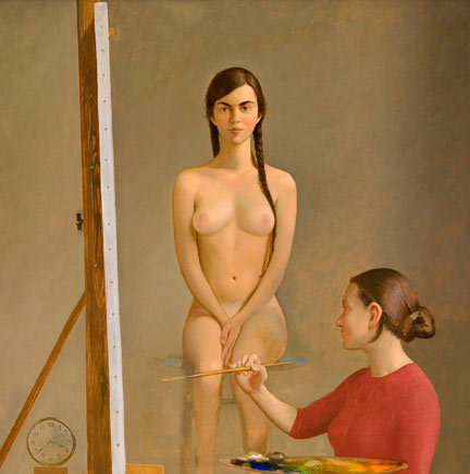
Bartlett
has one nude in this show, “Vashon Academy.” It isn't
strong. The main head, again face-on, is good, but the rest
threatens to dissolve. The background is empty, the clock isn't
round, and the legs and seat are nebulous. Beyond that, the
composition doesn't work. Why crop it there, except that he doesn't
like to paint feet? Are we to accept that the artist in the painting
is painting this nude so high and to the side, so that she has to
crane her neck between brushstrokes? And is that an attractive pose,
regardless, sitting straight up like a pole, with the hands lost in
the crotch and the feet dangling like noodles? Those legs would be
asleep in a matter of minutes, and her back, unsupported, would droop
in like time. Put that lovely girl in a real pose, and ditch the
rest of this fake composition.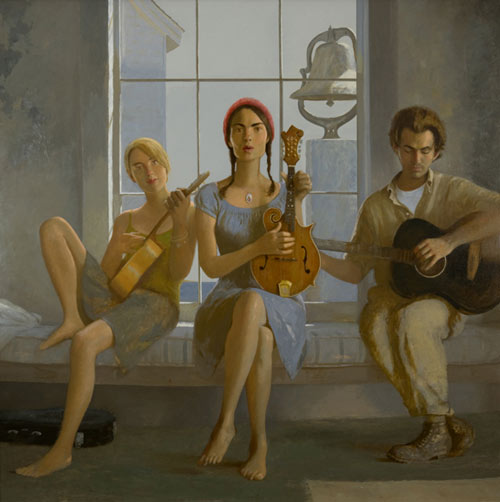
Lastly,
I will comment on “Commoners,” one of Bartlett's
signature square works with three figures. Looks like Bo, his wife,
and a pretty blonde friend. A trio of musicians is a serviceable
idea, and the bell outside is a nice touch, but otherwise this fails
to jell. It fails primarily because it is fake. These people don't
look like commoners. They look like pretty people pretending to be
poor and full of soul. They can't afford a sheet for the mattress or
paint for the walls or shoes for their pretty feet, but they can
afford an expensive mandolin and a twice daily shower. These hippies
or gypsies are entirely too clean. Even their feet are clean, in a
poor house that must have dirty floors. Plus, the girls don't appear
to be playing. They are pretending to play as they are pretending to
be commoners. Also, why is the light falling on the two girls in
different ways? The blonde looks a bit hazy all over, and it is
because her shadows are two steps lighter than the those of the
central figure. Wouldn't it have been better if the two dresses weren't so nearly the same color, and both so near the color of the background? We want the figures to stand out from the background, not dissolve into it. And we want each figure to have its own existence. The shaded off blue of the blonde makes her even hazier. The central model is striking enough to survive any competition: the artist didn't need to put the blonde behind a dirty glass. Even the feet don't work. Bartlett has four naked
feet to paint, which would be heaven for me, but he blows past them
like they are legs on the bed. The blonde girl's toes are barely
defined: the upper foot almost evaporates. And Sweetness' feet are
unconvincing. The hanging foot is too small, and the third toe on
each foot is slightly deformed. She may actually have toes like
that, but a fix was in order. An icon—even a commoner
icon—with curly toes is a distraction. Plus, well, you know,
“commoners” don't exist any more.
The word is outmoded. This doesn't look like a period piece (those
aren't period clothes), but “commoners” is a period word.
I
don't comprehend this entire show, or the intention of Bartlett, or
the intention of Forum Gallery. Forum would appear desperate for a
successful show, since Bartlett is not one of their “in house”
artists. He was not on their list before the show and is not now.
Except for Nerdrum, they don't have what one would call a strong
slate of realists, by any criteria. I don't like Nerdrum, but I can
admit he has some strong points. As for the rest, I don't see it.
So
they bring in Bartlett, drastically raise his prices in the middle of
a depression, and sell only two works. No doubt they blame him
entirely, but most of the blame is on them. They should have seen
that this collection of works couldn't bear a large price bump. Only
a couple of them were painted recently, the rest being unsold by
PPOW. Forum even stooped to misdating several of them, although the
real dates are listed on Bartlett's personal site. Forum should have
given him more time or been satisfied with a smaller show at lower
prices. But the real test is “Sweetness”. Since that
painting—which is perfect—didn't sell, we may assume that
the fault was with the gallery. It wasn't Bartlett's fault that
didn't sell. If a gallery can't sell a work like “Sweetness”,
even with a bad title, it can't really justify its existence, in my
opinion.
Beyond
that, the clientele for these realist galleries is a nuisance to art
history. They won't buy a work like “Sweetness” because
it is a portrait, but they will buy terrible manufactured scenes of
tragedy and banality, for reasons beyond artistic comprehension.
Look at this painting by another of Forum's artists, Paul Fenniak:
What
is the appeal there? Who would buy that and why? Or how about this
self portrait by William Beckman, which is sold: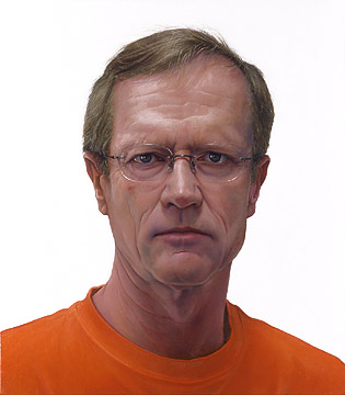
Somebody,
who we assume doesn't know Beckman personally, paid big money for
that. But “Sweetness”, which is vastly superior, doesn't
sell because it is too “portraity.” The world is full of
people who think it takes more
talent to paint with high detail, when the reverse is true.
Beckman's painting is an unattractive photocopy, which any camera can
create. He even gives us a stark white background, like a passport
photo. When Beckman feels highly creative, he reaches this pinnacle
of beauty: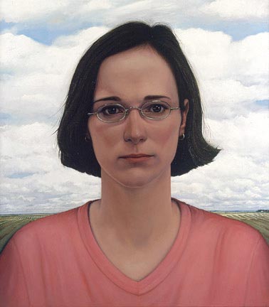
Although
it has bad light, a paste-in background, no brushwork, no expression,
and no mood, it sold. 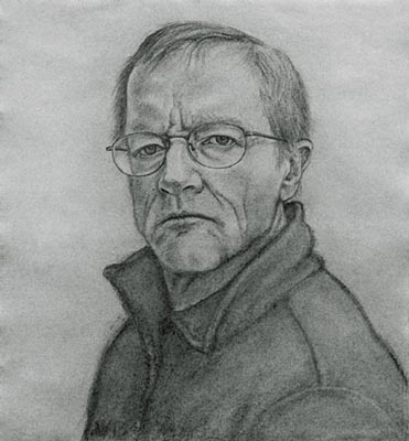
Even
worse are his drawings, clumsy and expressionless.
In
a similar vein is Robert Bauer. 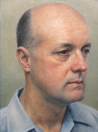
That
painting is 7.5 inches tall. Impressed? I'm not. No matter how big
or small it is, it is ugly and expressionless. I don't need a
painting of a bald guy trying to emote like a zombie, at 7 inches or
7 feet.
These
last examples are representative of realism in the top galleries.
The galleries and clients actually prefer bad work. They go mad for
empty and utterly inartistic photorealism, while ignoring real
painting. We can see this at John Pence, as well, another top
realist gallery. Look at this drawing by Michael Bergt:
That
is simply a stupid pose, neither graceful nor sexy nor anything else.
I have nothing against an open-pussy pose, but if you are going to
do it, do something with it. The internet is stiff with sex poses
that are more artistic than that, and yes, I use that first adjective on
purpose.
How
about this painting by Jacob Pfeiffer:
If
you find that clever, you need to check your nervous system for heavy
metal poisoning. Switch to a non-fluoride toothpaste.
If
you like that, you will go mad for this, by William Bartlett:
It
is called “Illusionist's Props”, so, yes, that is a
dummy's head. I know, it is hard
to tell, since most of the heads in these realist paintings look like
dummies' heads.
One
of Pence's most successful artists is Will Wilson, and this is one of
his most published images: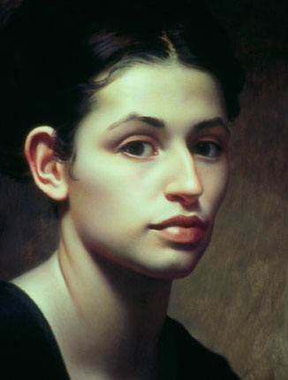
If
you can't see it, I will tell you that that is ugly in every
conceivable way. It is an aesthetic trainwreck, from subject to
concept to model to color to composition. Anyone who finds it
appealing should immediately be given a Rorschach test, a Zener test,
and a test for embedded ticks.
I
bring up these other artists to show you what Bo Bartlett is up
against in a show at Forum and in the realist market and in the
modern world. These are the gallery people and clients he is
expected to impress. Personally, I see it as a further virtue that
he failed to sell in this market. He would only have to worry if he
did appeal
to these folks. What a true artist wants is the greatest separation
possible from the current realist market and all the degenerate
people who inhabit it. Contemporary art, in all its forms—avant
garde and realist—is a shallow pool of corruption, imposture,
vulgarity, and false claims, and it sinks another level with each
passing decade. The true artist and true connoisseur must meet well
outside the normal channels, for the normal channels have long ago
been coopted by various species of podpeople. A few smaller
galleries here and there will have some real art, but at the top end
of the market there is nothing but the whine of promotion, the
vinegar of ambition, and the stench of greed.
In
my opinion, Bartlett should stick to painting the beautiful women and
girls around him, and give up trying to compete with the phonies. He
should also give up on politics, since it isn't his forte. His
wonderful portraits of his wife are worth more than all the fake
realism in a hundred galleries put together, and if they don't sell,
well, that is the world's loss, not his.
If this paper was useful to you in any way, please consider donating a dollar (or more) to the SAVE THE ARTISTS FOUNDATION. This will allow me to continue writing these "unpublishable" things. Don't be confused by paying Melisa Smith--that is just one of my many noms de plume. If you are a Paypal user, there is no fee; so it might be worth your while to become one. Otherwise they will rob us 33 cents for each transaction.