return to homepage A ĀDefenseĀ
ofĀ Subtlety (of
pastels and paper) Nietzsche told us, in
1888, that "it is easier to be gigantic than to be beautiful."Ā And Van Gogh added, only a year later,
"better a little wisdom than a lot of energetic zeal."Ā These are not very modern sentiments from
two of the (supposed) fathers of modernity.Ā
With giant canvases and much critical zeal Modernism has conducted an
all out war on subtlety for almost a hundred years. Traditional art has
suffered perhaps the worst fallout from this century of battles.Ā All of its virtues have been redefined, as
with one large brush, as faults.Ā But
subtlety was once considered an aesthetic fundament: Leonardo's chiaroscuro
was the technical pursuit of tonal and psychological subtlety; Rembrandt's
subdued lighting and choice of subject matter conveyed a sensitivity to shades
of meaning that has perhaps never been matched; Chardin's muted tones and
simple compositions subtly expressed the emotions of a family man; and artists
as recent as Whistler and Puvis de Chavannes all but defined their work by the
subtle and elevated moods it created.Ā
Even Picasso, before he became the Crown Prince of Modernism, created
paintings of astonishing nuance and passion—his work before 1906 is, by itself,
worth the entire 20th century in terms of subtlety. In this article I want
to suggest, contra the cries of the litterateurs and non-artist
intellectuals who have controlled recent debates, that subtlety, like beauty,
is not necessarily passķ.Ā Even
at this late a date it is still possible to believe that there are ways of expressing
oneself which remain quite powerful despite being neither direct nor
confrontational nor analytic.Ā Since I
am addressing fellow artists, it seems to me the best way to prove the
continued existence, and aesthetic relevance, of subtlety is by discussing
various ways of actually achieving subtlety in a work of art.Ā What I mean to share with you here is not a
technical blueprint for capturing depth in a work (which would be absurd) but
the various personal discoveries I have made which help me to avoid overworking
or overthinking a painting or drawing.Ā
This understanding—that beauty is the reward, not of persistence or
reason, but of sincere feeling—is the basis for artistic subtlety.Ā Of course, beauty is
also the reward of informed technique: visual art is the expression of the
abstract in the concrete, and no amount of zealous energy, or even
sincere feeling, can get one past the necessity of material mastery.Ā With this in mind, let us proceed from a
discussion of subtlety as it relates to Art (as a category) to subtlety as it
relates to art (as the work at hand), beginning with a few material
considerations. First of all, let us
consider choice of paper (to simplify, I'll limit myself here to drawing, but
most of what I say translates fairly obviously to other media).Ā Much contemporary pastel work is done on
sandpaper, some of it subtly.Ā But I
find that sandpaper discourages me from blending with my fingers (I begin to
lose skin after awhile); and this "smudging," done correctly, can
create a beautifully subtle effect.Ā I
believe it allows me to get in my drawing, to finally close that gap
that always seems to be filled by something—a brush, a stomp, or a stick of
chalk.Ā When I blend with my fingers, I
feel that drawing becomes almost sculptural: my hand finally makes contact with
the support.Ā As when working with clay,
I must get my hands dirty to make the proper connections.Ā The dust on my fingers, once it creates a
layer, begins to act as a middle tone, pulling my color harmonies together and
acting as a blended grey, like the mixed grey made from the colors on my
palette when I am painting.Ā To be more
specific: if I am using oranges and reds in the skin tones and greens in the
background, the "mud" deposited on my hands from both colors will mix
into the perfect middle grey—a grey that will pull the drawing together,
harmonizing the already complementary reds and greens (because it contains
them), and keeping any bright highlights from appearing too harsh. I don't smudge everything
(the highlights and other final remarks are left alone), but I believe that
those who would legislate against any blending or smudging have become
slaves to their methods—forgetting that, to the artist, everything is
allowed.Ā I know that this will come as
a shock to those taught never to blend or smudge and to keep all their colors
clean and bright.Ā If the effect you
want is cleanliness and brightness, this is fine.Ā But for me, such effects can be antiseptic.Ā Human emotions are rarely clean and
bright.Ā Life is messy, and a drawing
that is too perfect—that has every mark in place, every color undiluted, and
every compositional device in balance—will have failed to capture the
truth.Ā Put simply, if you over-refine
your work you will likely distill all the emotion out of it, and be left with a
technically flawless drawing that is nevertheless uninteresting.Ā The Old Masters
understood this use of greys and browns as a unifying device.Ā Tintoretto and the other Venetian masters
were experts at mixing the perfect middle-tones, and they were not afraid to
leave vast areas of unworked (toned) canvas or paper showing between their
figures.Ā The "tonalists" in
the 19th century also knew the value of grey and brown. Whistler called his
painting medium "soup"—a Āgrey-brown
mess that he was able to manipulate into the subtlest of effects.Ā And Degas layered his colors over and into
sublayers of much more muted shades.Ā It
is proper to beware of muddying your work (mainly through overworking
it, so that the middletones invade the highlights).Ā But you must realize that brown or grey may be used effectively,
not to obscure, but to harmonize. Like the middle-grey
dust on my hands, the color of my paper also helps me pull my drawing
together.Ā Generally, in drawing with
pastels, I use one of two papers: Fabriano Ingres or Ingres Antique.*Ā Both have a lovely surface with enough tooth
to hold the charcoal *I get them from Daniel
Smith, in Seattle. I highly recommend Ingres Antique camel, a warm
brown paper. or pastel but not so
much that the laid pattern becomes aggressive.Ā
About 90% of my drawings are made on grey or light brown paper.Ā These colors reflect my predominant moods, I
suppose.Ā The paper color also serves as
a suggested aura of the model's mood.Ā
Grey suggests an aloofness, perhaps.Ā
Brown is also introspective but conveys more warmth.Ā Depending on the light falling on my model,
these colored papers also work as middle fleshtones, allowing me to elide from
the darks to the lights without actually having to draw all the tones in
between.Ā For example, if I am drawing
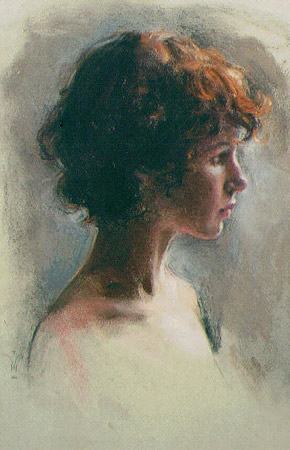
under a cool north light, my model's skintones will include much grey in the
middle colors, and if I draw on a grey paper I can leave parts of the face
(around the eyes and mouth, or on the throat, for instance) just suggested or
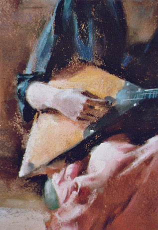
smudged without creating a full layer of pastel.Ā You can see this effect in my drawing Monique Bleu.Ā Or in the detail of Girl with Balalaika you
can clearly see the brown paper showing through in many parts of the drawing,
and only a few areas are worked heavily.Ā
This is not just a time saving device: I do not want to work all
the parts of a drawing equally.Ā A
drawing with the same amount of finish everywhere tires the eye and has no
focus no matter what other tricks one may use to draw attention.Ā ĀĀĀĀĀĀĀ This brings us to the
next important aspect in creating a drawing of subtle emotion: light.Ā For me, the best way to light a subject for
an interesting psychological rendering is with window light.Ā To bring out the three-dimensionality of a
face or figure, and thereby its personality, requires shadows.Ā And the most natural shadows are created by
natural light, of course.Ā Outdoor
light, at dawn or dusk, can be very expressive (as most photographers know),
but it cannot give you the dark shadows that window light does.Ā Edge lighting, back lighting, and half and
three-quarter lighting help me to evoke a variety of emotions, and I recommend
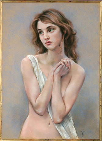
such experimentation to anyone interested in using light to create a mood.Ā In Red-haired Girl ĀI used edge lighting on the model's profile
to accentuate her striking nose and long neck.Ā
The fact that most of her head is in shadow, while only her left
shoulder is brightly lit, leaves much of the drawing a mystery—as indeed it
must if it is to have any interest.
For me, the best pose,
like the best light, is natural.Ā As far
as possible, I let my model alone, so that she is not posing so much as just
being still.Ā I sometimesĀ make suggestions, but I try to watch rather
than direct.Ā In this way I discover how
my model expresses herself.Ā A body does
not communicate by striking preconceived poses.Ā It communicates by making the movements that come natural to it,
that are part of its nature.Ā Rodin,
describing this process in his method, was chided for being passive.Ā Wasn't he, the critic asked, taking
directions from his models, and so giving up his claim as creator?Ā "No," answered Rodin.Ā "I do not take directions from
them.Ā I take directions only from
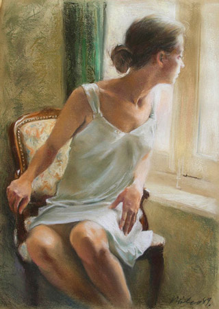
Nature." In composing the drawing
Waiting, I simply asked my model to look out the window.Ā I did not create the pose; I discovered
it.Ā I waited for it.Ā When I saw the composition fall into place,
I knew I had found what I was looking for.
Since the composition in
Waiting is central to its effect, let me discuss for a moment composing
a picture for an emotional response.Ā
The emotion depicted here, it seems to me, is isolation married to a
sort of expectancy.Ā The model's head
going one way and her knees going the other creates a tension, and the white
light from the window falling directly only on her face heightens the tenor of
the emotion.Ā Cutting the drawing off
below the model's knees brings her closer to the plane of the picture, and
therefore to the viewer, also adding to the intimacy.Ā This analysis I can give
you after the fact, but I cannot tell you that the drawing was consciously
planned this way.Ā For me, it is
counterproductive to orchestrate a drawing, to know what it will be before it is.Ā I don't even try.Ā Obviously, some part of me knows what I am doing, but it seems to
me that my artistic choices are never rational.Ā I don't think; I desire. ĀMy left-brain, my Ego, is off; and my Id is
free to do whatever it wants.Ā Some
technique has been sublimated, so that it can be used by my passions, but it is
never analyzed.ĀĀ I never do
anything because; I just do it.Ā I mention this because I
feel it is very important.Ā There is
nothing wrong with talking about technique or with learning from others; but
one must understand that the impetus for art is never technical or rational—it
is personal and emotional.Ā If you are
an artist, you draw because you feel like making a drawing, not because
you want to work out some technical problem.Ā
Allowing your left-brain, your scientific side, to start meddling in
your creation is like letting the fox in the henhouse, and your inspiration
will be lost in a cloud of feathers. What this means,
specifically, for the creative process, is that the time for me to analyze my
work, the time for me to learn from myself, is after I've done it, not
before.Ā I try to follow my heart, my
intuition, into a drawing, and let it happen.Ā
I don't feel like I have to work everyday.Ā I wait for the inspiration: wait until I can say "that's it,
that's what I was looking for."Ā
And then I go, and it never feels like work.Ā Only after much time have I begun to
understand my inspiration, to find it where I look for it.Ā It cannot be forced: the Muse was not made
to be forced.Ā I think if you try too
hard you destroy your inspiration, muddying the waters and discouraging
yourself with bad work.ĀĀĀĀ One more thing needs to
be said about composition in this context, and that is that when I have been
the most impressed by a drawing's ability to pull the eye in, past the
surface and into the emotion or meaning or content of the work (which is the
most straightforward description of depth that I can think of), I have
found that the artist has achieved this depth, in part, by keeping the
composition simple.Ā He has avoided any
extraneous elements, any clutter.Ā Every
great work that I can think of that expresses a subtle, singular emotion has a
strong primary focus (often only a primary focus).Ā Every other thing in the painting—every object,
every background line, every strong color—supports the primary focus.Ā If it does not it disturbs the eye and
inhibits the emotions.ĀĀ When artists treat the
figure as a decorative device they can afford to have a more complex
composition—creating, as it were, a still life in which the human body is one
of the objets.Ā But when they are
concerned more with the individual mood that the model suggests, not just
physically, but psychologically, they purposely limit the composition—they
create a stillness in which the viewer can travel that distance from the
subject's face or body to his or her passions.Ā
Think of Picasso's Old Guitarist, a painting in which every line
is expressive of the mood.Ā Or think of
Degas' Woman Drying Herself (any one of them): the composition is
simple, straightforward, and elegant.Ā
Even Van Gogh, who was not interested in subtle colors or lines
or passions, kept his compositions simple and focused, for this reason.Ā His color and brushwork and swirling
backgrounds, though often violent, are never gratuitous: they all combine to
express the psychological state of his subject (or himself), and, no matter how
manic or overwrought, always center on that window of the soul, the eye. Finally, it almost goes
without saying that when one wants to create a subtle effect, one uses subtle
colors.Ā This is not to say that every
psychological effect one might want to depict will be a subtle one.Ā Van Gogh's colors and effects were anything
but subtle, and yet his paintings are incredibly powerful.Ā But other emotions, though less spectacular,
are no less powerful, and cannot be depicted with glaring colors.Ā Van Gogh's idol, Millet, knew this, as did
Corot and many other pre-Modern masters.Ā
The point is to choose colors carefully, being fully aware of their
impact.Ā One must be sincere.Ā And honest.Ā
The true artist does not use bright colors because they are fashionable,
because they meretriciously draw the eye, making it easier to attract attention
to the work.Ā He will leave these tricks
to Hollywood and the Moderns, where subtlety is a non-issue.Ā If a brown or grey expresses what he want to
express, the artist will use it, letting the yawns of the glitterati wash over
him like the brown waters of the Ganges, leaving him only holier. If this paper was useful to you in any way, please consider donating a dollar (or more) to the SAVE THE ARTISTS FOUNDATION. This will allow me to continue writing these "unpublishable" things. Don't be confused by paying Melisa Smith--that is just one of my many noms de plume. If you are a Paypal user, there is no fee; so it might be worth your while to become one. Otherwise they will rob us 33 cents for each transaction. |