return to homepage IN PRAISE OF MUD
return to updates
by Miles Mathis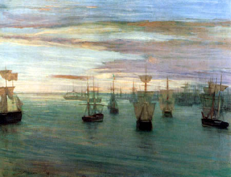
by Whistler
In all beginner and intermediate painting classes, one of the biggest foes is what is called “mud.” This is the mud created by improper mixing of colors, so that the paint layer loses its intended color and value. I can't defend an improper mixing, of course, but I do intend to defend the proper use of mud. The proper use of mud is the use of these browns and greys and dirty colors in a painting when they are needed. And they are needed, not just “at times”, but in all paintings.
Contemporary realists tend to flee mud at all times, and there are many reasons for this. First, after fighting against improper mud in school and in the early years, it is difficult for a painter to embrace proper mud later on. Young painters are taught to chase clean, clear colors, and as they get older they often come to the conclusion that cleaner is always better. The cleaner you are, the better painter you are. But this is false. Second, many realist painters come to gallery painting from advertising or illustration, where everything is expected to be sunny and happy and simplified and Disneyfied. They are taught or encouraged to oversaturate colors, key up everything, flood everything with light, and eliminate all shadows and ambiguities. Browns and greys are to be avoided, since browns and greys don't sell products to shiny happy people. Third, since the contemporary realist market has already been Disneyfied, they find that the same applies to “high art” as to illustration or advertising. The shiny, happy people want bright, clean colors and sunny vistas. The artists don't realize, or prefer not to admit, that this means that “high art” is no longer really the product. They are not selling high art, they are selling illustration and advertising as easel paintings, that's all.
Next time you go to a realist gallery, look for browns and greys and dirty colors. You probably won't see many, if any. This is because most realists now consciously avoid browns and greys and all earth tones. The realist palette is not what it was 100 years ago, in the time of Sargent and Sorolla. Sorolla is considered not just a great colorist, but a high colorist. And yet his palette would be considered very drab by today's standards. The contemporary realist palette gets closer every year to what I call an “acrylic” palette. That is, a palette of bright plastic colors only, with no browns or greys. While the old realist palette consisted of yellow ochre, red ochre, and burnt umber, for instance, the new palette will have replaced these with cadmium yellow, cadmium red, and no browns at all. This gives the contemporary realist painting more color and saturation, but it also gives it a crushing lack of tonal complexity, a complete loss of subtlety, and an obvious shortcoming in color harmony.
All the great colorists and tonalists of history, from Giorgione to Whistler, understood that you have to play your colors off the browns and greys and blacks in the painting. Just as you can't have only browns and greys, you also can't have only the colors. If you want a richness and complexity to your paintings, if you want any kind of extended harmony, you have to have dirty tones as well as clean tones. The colors only read as pleasing if you surround them with less color. A harmony is created not just by balancing the colors in the painting, or by balancing the darks and lights; at higher levels, it is created by balancing the colors against the greys and browns. In other words, the eye must have places to rest in the painting, otherwise it doesn't know where to go or how to construct the harmony.
Just as you can't have the same energy from corner to corner, you can't have the same amount of color from corner to corner. A painting is like a piano concerto: it must have some slow passages and some soft passages. It requires empty space as much as, or more than, it requires objects. And it requires low color as much as, or more than, it requires high color.
The ultimate reason for all this is that nature has decreed it. We are all children of nature, and our sense of harmony comes directly from her. Nature is full of color, but she is also a master of browns and greys and dirty tones. Even the blues in the sky are shaded off and dirty. The greens in the trees and grasses are soft and mixed, and the yellows are likewise low-toned. Every color is reflecting off every other color, and thereby diluting it. Why do you think the hazy harmonies of Leonardo or Chardin or Corot are so calming and transcendent? It is because of this reflective complexity. Or, to state it more directly, it is because they knew how to use greys and browns. They knew how to muddy their tones to the extent nature does, but no more.
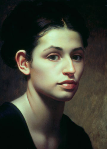
This applies to skin as well as to trees and grass and skies. The pandemic problem with modern skin-tones is a lack of complexity and an over-saturation of color. All living beings are re-constituted mud, and we retain the browns and greys of that mud in almost all conditions of lighting. You cannot build a skin-tone from just red and yellow and white, although many try to. Nor can you build a skin-tone or shadow by mixing complementary colors. Skin is usually not that rich. Skin is almost always reflecting and absorbing browns and greys and blacks from its environment, not just the colors, so it can't be built from color alone. Van Dyck understood this. He was probably the best portrait painter of all time, and his paintings are very colorful, both in saturation and complexity. But he did not feel the need to oversaturate his skin-tones. A close analysis of his skin-tones will show that his shadows are often built mainly by adding black to his middle tone. This would be forbidden in a contemporary class, since most think it would immediately lead to improper mud. Many are taught never to use brown or black to darken a tone. And, admittedly, improper mud is often created this way. But Van Dyck showed it could be done. The difference between improper use and proper use is very small, and it is not a categorical difference of technique. In other words, you do not avoid or surpass improper mud by switching from brown and black to bright color, you surpass it by using the right amounts of brown or black in just the right places. The difference between improper use and proper use is one of precision. A great painter is more precise than a lesser painter, not only in his line but in his color mixing.
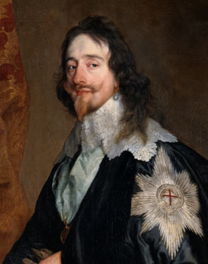
Notice the forehead, where the shadow is made from black
The same problem is encountered by pastellists, and I have already commented on it in my paper on pastels and subtlety. The contemporary pastellist is so afraid of mud that he will not allow himself to blend, for fear of creating an accidental brown or grey. Contemporary pastels are all about bright, clean colors. But this is precisely what keeps them at the Disney level of art. A real work of art requires these browns and greys. You should not avoid mud, you should learn its proper use. I often mix charcoal into my pastel colors, purposely to tone them down. This seems like blasphemy or counter-intuition to most these days, I know, but it is one way I create my subtle harmonies.
A critic will say, “That is all fine and good if you want to create sadness or melancholy, but if you don't, then you don't need browns and greys.” False once again, since using browns and greys is not a matter of a painting's emotional tone, it is a matter of a painting's complexity and harmony. Even happy paintings must or should have color harmony and complexity. Any painting, no matter its intended mood, will be richer and deeper and more real if its creator is in proper control of color. This is because all painting is a matter of technique, no matter the subject, and technique is not limited to good drawing, composition, lighting, color, or any of the other well-known factors. It is also a matter of some factors that are not so well-known anymore, and the main one is this one I am resurrecting. Color harmony is not just balancing color, it is balancing colors against lesser colors. It is balancing richer colors against muddier colors, and against browns, greys, and blacks. All the great “colorists” in history have proven this again and again. As another example, go to Titian, known as one of the best colorists ever. Titian's paintings are full of browns and greys and blacks and muddy colors. His beautiful reds wouldn't look nearly so rich if they were not playing off this background of the “less rich.” If you want to make a red look redder, you don't put it next to a bright green. You need some green in the painting, yes, but to make the red look richer, you surround it with browns and greys and muddied-up reds. Specifically, you take the red, mix it with green, and then place that red-grey near your saturated red. That is how you create the complexity.

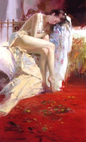
This is one of the (many) places that Pino always fails. Pino often uses reds to attract the eye, and he tries to enrich his red schemes by surrounding them with shaded-off reds. Unfortunately, he shades his reds off into pinks, by adding white to them. Instead of supporting his reds, this just dilutes them. He does not create a harmony or any richness, he just creates a pastel nightmare. He doesn't need pinks, he needs greys and browns that contain his main red. But, since his main red is often a cadmium red to start with, he can't create a natural mud from it. Cadmium is not a natural shade. It is ugly right out of the tube. Therefore any grey or brown made from it, or made to complement it, will also be ugly.
Pino's skin-tones are also pinkish here, for the same reason, and they fail for the same reason. Skin-tones must be created by using the correct mud, not by using some pre-mixed skin-tone from a tube. Either with oils or with pastels, this mud must be created fresh from the particular colors in the subject at hand. Readers will say, “Surely you don't add charcoal to your skin-tones, in a pastel!” Yes, I do. Just as Van Dyck often used black in his faces, I use charcoal in mine. You should be just as wary of using too much color as of using too little. Skin is very subtle, and a little color usually goes a long way. Charcoal also has almost no tinting strength, so it gets eaten up by the pastel. Mud is much easier to avoid in a pastel than in an oil painting.
But even in an oil painting, I use forbidden colors in the skin. To create complexity, I often start a skin-tone by using all the colors on my palette, or at least the ones that will be in the painting, including black. You will say, “Good Lord, why would you do that?” For the reason I mentioned earlier: the skin will be reflecting all the colors around it. Van Dyck used black in his skin precisely because his sitters were wearing it. It was there. Now, admittedly, I can't build a skin-tone by stopping there. All the colors together give me a brown mess: mud. But I don't stop there. I push this mud toward my skin-tone, adding red and yellow and white and whatever else I need, until I reach the shade I require. In this way my final skin-tone contains them all, without obviously containing them all. It is only very slightly muddy. This “very slightly muddy” is the same as “complexity.” It is the reason my skin-tone looks more like a real skin-tone, and more like an Old Master skin-tone.
White lead also helps in this regard. White lead has a lower tinting strength than titanium or zinc, and it is more transparent. I have recommended white lead in other places, due to its permanence and its warmth, but its main usefulness in skin is due to the fact that it doesn't overwhelm the colors it contains. It is more subtle. It carries the colors and lightens them without chalking them up like titanium or zinc does.
I use green earth for the same reason. You can put green earth in a skin-tone without turning it green. It adds complexity without causing improper mud. If my subject is surrounded by trees, for instance, I don't add leaf greens to my skin, I add green earth. Green earth is one of the ingredients of proper mud.
The same applies to red earth and yellow earth and the umbers. These are mud colors, made from real mud, and they have low tinting strengths. They are much easier to manipulate in skin than the stronger cadmiums. Cadmium is not a mud color: it is useful only for creating mannequin skin-tones. You don't even need it in the lips, where crimson is much better.
The plastic skin of Will Wilson
In the end, cleanliness is overrated in painting. You don't want a clean painting: you want to make a beautiful mess. Not only should you not avoid mud, you should create the correct and proper mud on purpose. A refined technique is precisely this learning to push your mud toward the tones you desire. This is what Whistler's emphasis on the palette came down to. He required his few students (like Gwen John) to mix their tones on the palette, before ever putting a brush on the canvas. The tones he told them to look for were these: he wanted a color trio that expressed the major tones of the canvas. But none of these three colors were clean colors. They were complex mixes to begin with. For instance, the color trio might be a purple-grey, a pale yellow, and a grey-green. And each of the three would already contain a bit of the other two. In other words, the pale yellow might be greyed out a tiny bit by purple and green. But then, even after that, he would ask the student to create middle tones among the trio: to search for browns and greys between each trio combination, to use in the background. Gwen John's longsuit was her understanding of Whistler's method, which gave her paintings this complex harmony and calm beauty, despite her limited drawing skills.
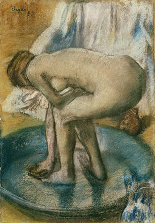
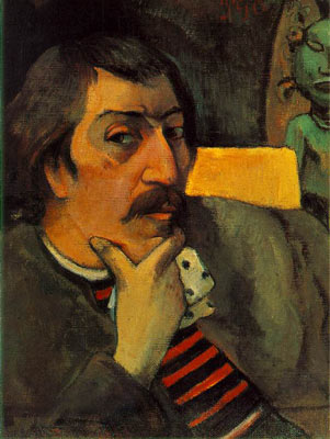
It is well known that Impressionism overwrote and destroyed this deeper knowledge of color harmony, but many of the original Impressionists knew the laws and used them. Manet, especially, was a master of grey. His color use came down to him from Velasquez. Renoir and Morisot also ignored the rules of Impressionism most of the time, and their paintings are quite low- toned and grey compared to the new realists. Likewise Degas, who was a master of brown and grey and mixed tones. Even Gauguin still understood this, and he based his Tahitian harmonies on mixed colors, and color played off brown and grey.
New realists have uncovered many techniques of the past, but they have mostly neglected this basic understanding of the finer points of color harmony. And they have neglected the browns and greys for so long that the mainstream clients now find something strange and alien in a painting that has not been Disneyfied. The average painter and client and gallery owner's ability to judge has been limited by their experience, and any painting that does not look like the ones around it must be inferior. This turns not only history but the very idea of quality on its head, and I have actually heard modern people say that Pino is better than Sargent, since he is more colorful in an absolute sense. We can only pray to the Muses to arrive at the far end of this trend with our souls somewhat intact.
If this paper was useful to you in any way, please consider donating a dollar (or more) to the SAVE THE ARTISTS FOUNDATION. This will allow me to continue writing these "unpublishable" things. Don't be confused by paying Melisa Smith--that is just one of my many noms de plume. If you are a Paypal user, there is no fee; so it might be worth your while to become one. Otherwise they will rob us 33 cents for each transaction.